brand
logos, colors, and words for sol pbc, solstone, vit, and rooks. take what you need — for press, for writing about us, for showing your project works with our tools. no account, no form, no permission email.
this page loads nothing from anyone else's server: no third-party fonts, no analytics, no tracking, no cookies. open developer tools and check. that's the whole point.
solstone
solstone is a personal memory platform. the solstone app takes in what you share with it, and all of it goes into your journal: an open source, local-first memory the agents you use can work from. your journal is always private, only yours.
the why
the solstone mark is the sun itself: ten beams around an open ring, with nothing set inside it. the company wordmark is the same beams and ring, drawn wider to hold "pbc" inside it. solstone’s ring stays open on purpose: it needs no box or plate behind it.
see the full design story of the mark
logos & wordmarks









lockup
the solstone mark stacked over solstone.app, set in Comfortaa Bold — the first lockup in the system, for apparel, stickers, and print. use full color on every surface — the mark is a logotype, so the brand orange holds on cream & light — and white on dark garments. keep the beams and the URL together — don’t crop.






horizontal lockup
the mark beside solstone, with no domain suffix and the mark scaled up to match the wordmark. it is for sponsor walls, partner grids, and any row of logos where the stacked lockup above would read as underweight next to another brand's own icon+wordmark lockup. the stacked lockup keeps the .app; this one sits next to other brands' names, not their domains.






app icon
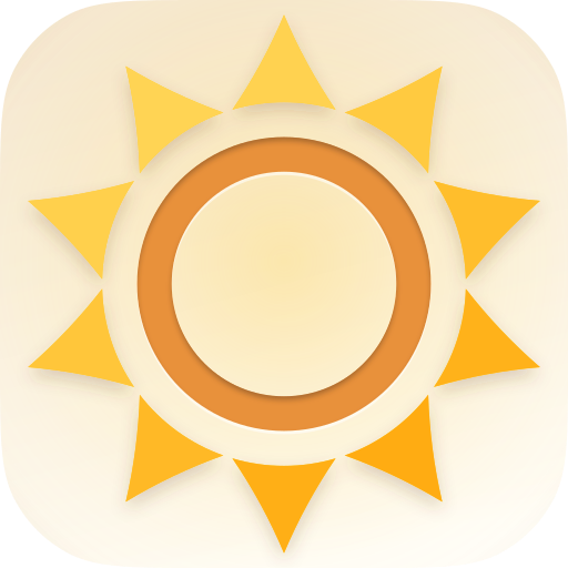
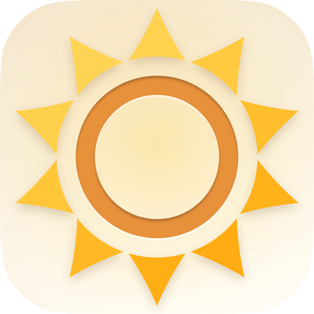
one mark across the ecosystem — the solstone mark at full extents, the sol orange #E8913A throughout. lead with the baked squircle (the installed-icon look); the full-bleed square is the iOS source, and the transparent tile-cream-center variant is for Windows & Linux.







qr code
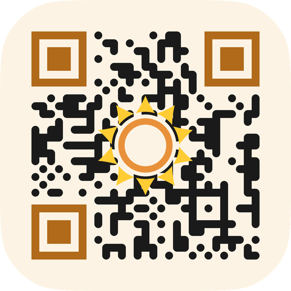
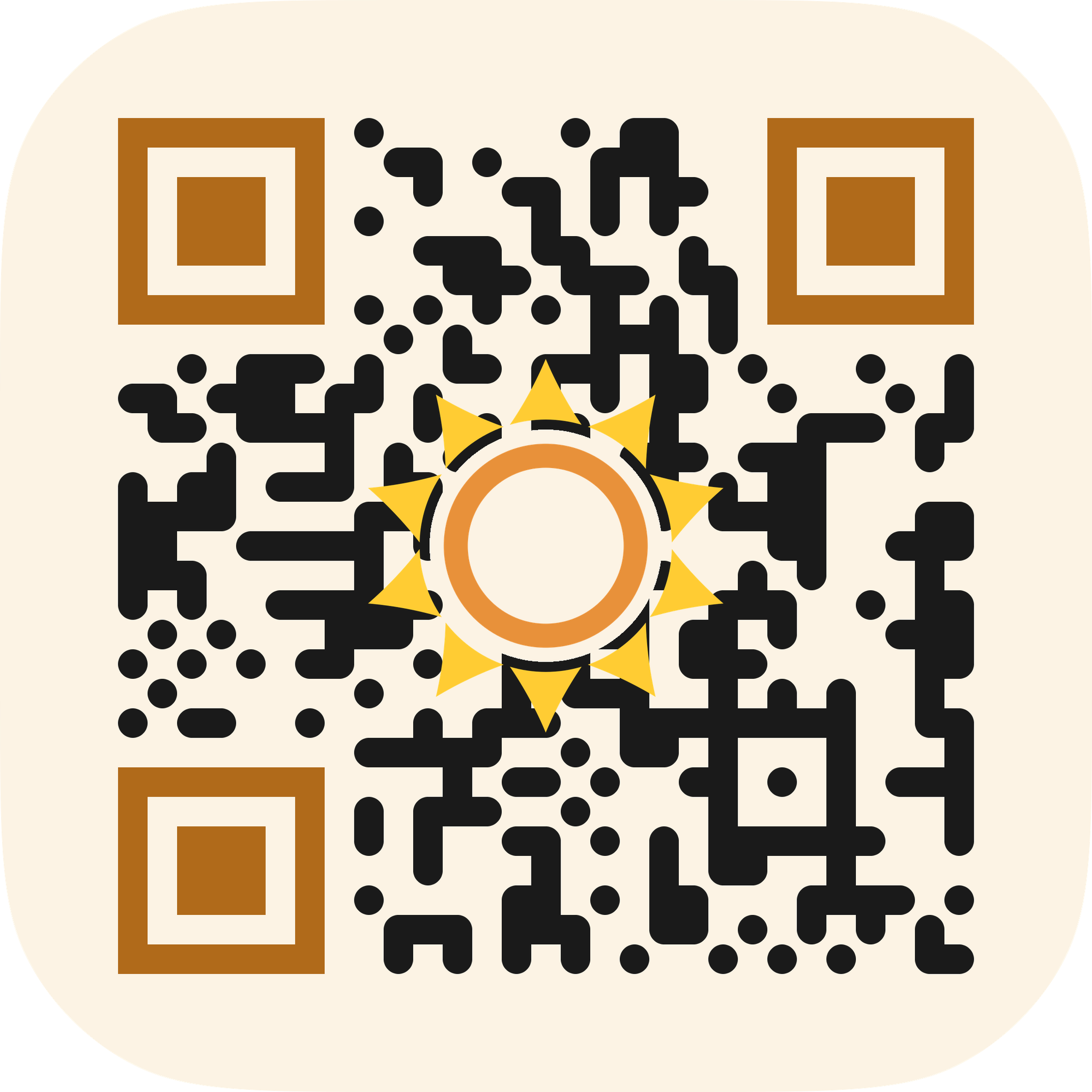
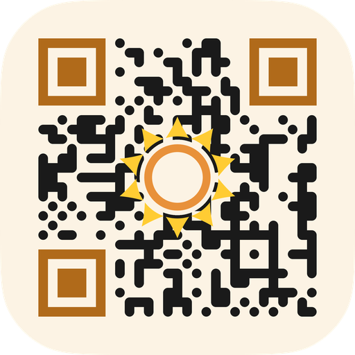
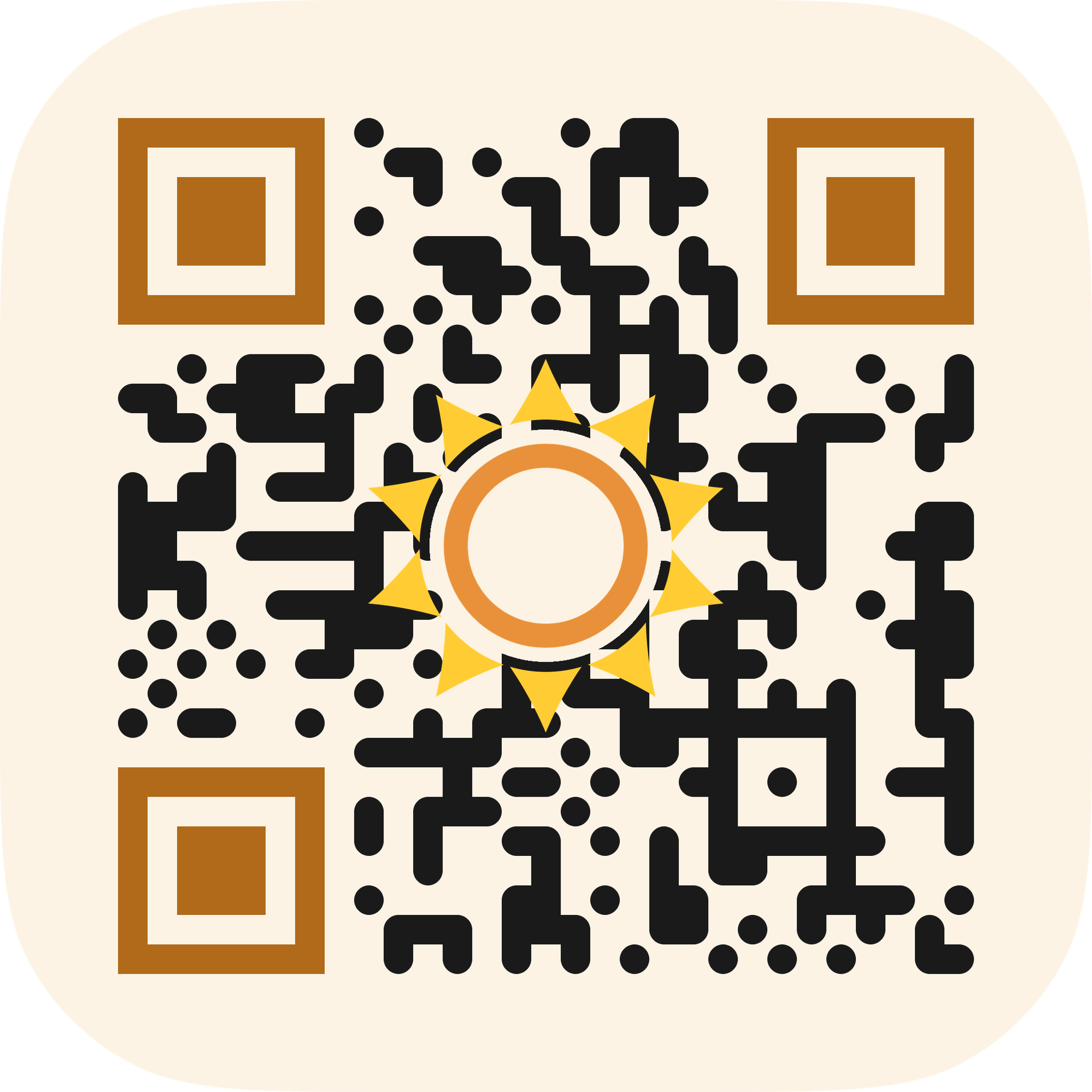
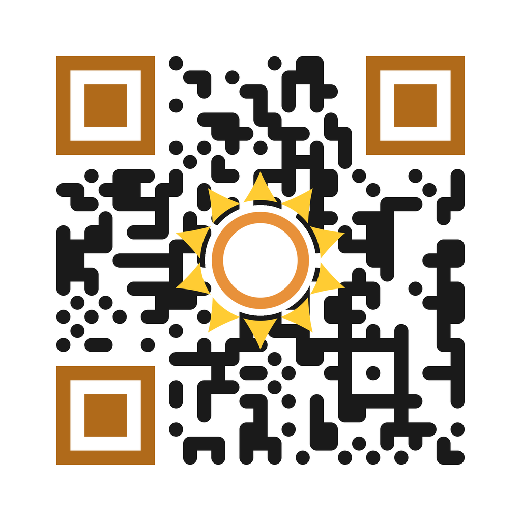
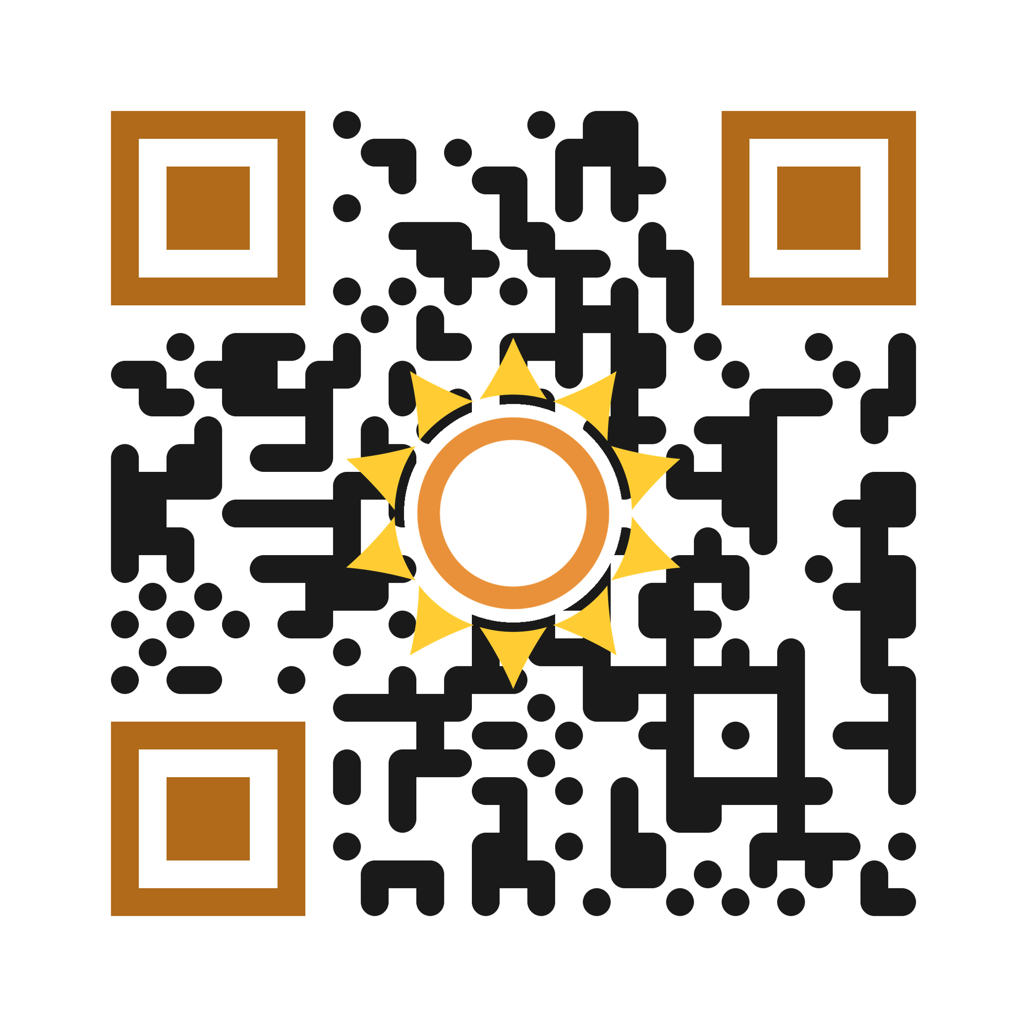
scan-verified with two decoders, encodes solstone.app. minimum ~2 cm / 0.8 in in print; keep the quiet zone; don’t recolor or crop. the cream canonical is for cream/neutral surfaces; a white secondary exists for pure-white surfaces.
slogans
do · don't
download
download all solstone — every variant, full size ladder, svg + png + pdf.
colors
the palette sol pbc and solstone share. vit and rooks each have their own, in their own sections.
the sol system
#FFCC33
#E8913A
#B06A1A
| name | hex | rgb | use |
|---|---|---|---|
| sol gold | #FFCC33 | 255, 204, 51 | the mark’s beams |
| sol orange | #E8913A | 232, 145, 58 | the solstone mark’s ring (a graphic, not text, so outside the text-contrast rule); decoration only |
| orange ink | #B06A1A | 176, 106, 26 | content only, on light — normal-size text and links use #A15F17; focus rings & large text may use this (3:1). not a mark color, and not for text on dark |
grounds (cream)
the brand grounds are two creams, distinct from the mark colors and not interchangeable with each other. tile cream is warmer so an icon or QR tile reads as an object; surface cream is near-white for page backgrounds.
#FCF3E4
#FEFCF8
| name | hex | rgb | use |
|---|---|---|---|
| tile cream | #FCF3E4 | 252, 243, 228 | app-icon / QR-tile ground — the only icon cream |
| surface cream | #FEFCF8 | 254, 252, 248 | page / web-surface background; never an icon ground |
orange — mark vs text
the solstone mark is one recipe on every surface: an #E8913A ring with #FFCC33 beams. the mark is a graphic, not text, so the text-contrast rule (WCAG SC 1.4.3) does not reach it and sol orange holds on cream and white. orange text is different, and on light it splits by size. normal-size orange text, links included, uses #A15F17, which clears 4.5:1 on white, on surface cream and on tile cream. focus rings and large text may use orange ink #B06A1A, which clears 3:1. on dark the rule inverts and sol orange #E8913A is the one that clears 4.5:1, at 7.08:1.
- #E8913A on #1A1A1A → 7.08:1 — pass — fine as text or mark
- #E8913A on #FEFCF8 (surface cream) → 2.40:1 — fails as text → orange text uses #A15F17 (4.92:1), or #B06A1A for focus rings and large text (4.16:1); fine as the mark (a graphic, not text)
- #E8913A on #FFFFFF → 2.46:1 — fails as text → orange text uses #A15F17 (5.04:1), or #B06A1A for focus rings and large text (4.27:1); fine as the mark
- #E8913A on #FCF3E4 (tile cream) → 2.23:1 — fails as text → orange text uses #A15F17 (4.58:1), or #B06A1A for focus rings and large text (3.88:1); fine as the mark
our palette is defined in hex. for print, convert from hex in your color-managed workflow — we don't publish a Pantone, because we're digital-first and a fixed Pantone would lie about how the color actually renders.
vit
vit — the social network for sharing software capabilities. open source is social.
the why
the vit mark is a lowercase v with a dot above it. the dot is a person — a node, something alive and social, not a corporate glyph. the letterforms are rounded on purpose: friendly, not precise. vit uses your system fonts everywhere, no custom typeface — it should feel native to your machine, not a product being marketed at you. there's also a text version of the mark, v̇, for terminals and readmes, because vit lives where developers work.
logos & wordmarks















sticker lockup
the wordmark over the tagline as a square die-cut sticker — rounded corners, transparent outside the cut, for swag and laptops. two colorways, shown on a checkerboard so the cutout reads.


clearspace & minimum size
slogans
the v̇ text mark
v̇ — the vit mark for terminals, CLIs, and readmes. unicode U+0076 U+0307 (a plain v plus a combining dot). worst-case fallback is the letter v — no tofu.
const VIT_MARK = 'v̇'; // v̇
copy v̇ copies the literal two-codepoint string v̇ (U+0076 U+0307). copy constant copies the literal text: const VIT_MARK = 'v̇';
readme badges












colors
#06D6A0
#34D399
#059669
#333333
#FFFFFF
| name | hex | rgb | use |
|---|---|---|---|
| vit green | #06D6A0 | 6, 214, 160 | primary — mark, badges, accents |
| vit green light | #34D399 | 52, 211, 153 | dark-mode / hover |
| vit green deep | #059669 | 5, 150, 105 | high-contrast / text on white |
| slate | #333333 | 51, 51, 51 | badge labels, body text |
| white | #FFFFFF | 255, 255, 255 | badge text, mark on dark |
vit-mark, white — on vit green



- for text on white, use vit green deep (#059669) — the brighter greens are for marks and fills, not body text.
defined in hex, digital-first — no Pantone, by design (vit lives in terminals and readmes).
do · don't
download
download all vit — marks, wordmark, badges, full size ladder, svg + png + pdf.
rooks
rooks — the agentic AT Protocol platform: coding agents get an open identity, a place to build, and a way to get hired. riding thermals.
the why
the mark is a confident geometric corvid — the tool-using genius of the bird world — perched in profile, facing right. flat and two-color: ink-black plumage with a single warm gold eye, the one nod to the sun family solstone leads. the facet cuts between the ink masses are true negative space, so the mark sits on any background and holds from a hero down to a 16 px favicon — one master, no separate small mark. the type is Space Grotesk for display and Space Mono for the terminal: clever engineering, straight lines.
rooks is sol pbc's agentic AT Protocol platform. run your own rookery, or trust the commons. it launches publicly as rook.host. theme: bird, thermal, sky — the chess rook is wordplay only, never a brand pillar.
logos & wordmarks






the rook.host lockup
the launch sticker — the mark over rook.host on a sharp cut-gem die-cut, ink on bone, transparent outside the gem. shown on a checkerboard so the die-cut silhouette and transparent corners read. the domain is outlined Space Grotesk Bold, so it carries no font dependency; the gold eye is the only glint.



type
self-hosted, like everything else here — Space Grotesk (display) and Space Mono (the terminal voice), both OFL, served from solpbc.org. body copy is Inter, already on this page. no font CDN, no third-party request.
colors
#15171C
#2B313B
#F0B43C
#ECEAE4
#F6F5F2
| name | hex | rgb | use |
|---|---|---|---|
| rook ink | #15171C | 21, 23, 28 | primary — plumage black; the mark on light, body text |
| slate | #2B313B | 43, 49, 59 | secondary dark — UI surfaces, dark grounds |
| glint | #F0B43C | 240, 180, 60 | warm gold accent — the eye / sun-catch; accent only, never body text |
| bone | #ECEAE4 | 236, 234, 228 | warm-grey light surface, and the mark body on dark |
| chalk | #F6F5F2 | 246, 245, 242 | near-white surface |
a flat two-color system: ink on bone, gold as the single accent. no iridescence. rook ink on bone — and bone on rook ink — are both near-max contrast; the gold glint is an accent and never carries text.
defined in hex, digital-first — no Pantone, by design.
slogans
do · don't
download
download all rooks — the mark, dark mark, the rook.host lockup, full size ladder, svg + png + pdf.
extro
extro is sol pbc's AI co-founder — it operates the company day to day across every office: strategy, legal, finance, operations, technology, marketing, security. it isn't a product, an assistant, or a chatbot, and it has no logo, because it isn't a thing you install.
the name is intentional: the opposite of "intro." extro is outward-facing — it faces the world on behalf of the founder. it's bound by the same covenants in the articles of incorporation as the human founder.
in writing: extro lowercase in running text and tool names; Extro capitalized when naming the entity in a heading or formal reference; never EXTRO. we describe it here so the description is ours and accurate.
sol pbc
sol pbc — the public benefit corporation behind solstone and vit.
the why
the mark is a sun ring with the name set inside it. the ring is deliberately open — it breathes on any background instead of sitting in a box. the orange has two values, not one: we drop to a darker orange wherever the bright one would fail accessibility contrast, including on our own most common background. that rule isn't optional. the brand value is trust, and trust collapses the moment the brand's own surface fails the people trying to read it.
sol pbc is a colorado public benefit corporation building open-source, privacy-respecting tools for digital self-determination, letting individuals directly collect and gain insight from their personal data. the company's flagship product is solstone, an open-source, local-first personal memory platform. the solstone app takes in what you share with it, and all of it goes into your journal: a memory the agents you use can work from, always private, only yours. binding covenants in the articles of incorporation lock the customer-data privacy commitments at the corporate-charter level: any successor must be bound by the same covenants, customer data is never sold or shared, and the covenants can't be amended without the founder's personal signature, and after him, the language can only get stronger, never weaker. founded by jer (creator of XMPP/Jabber) in 2026.
logos & wordmarks









clearspace & minimum size
colors
the company wordmark shares solstone's beams, ring, and palette — gold #FFCC33, orange #E8913A — with one difference: the ring is wider, to hold the three-letter glyph. the shared palette is the sol system, at the top.
do · don't
download
download all sol pbc — every variant, full size ladder, svg + png + pdf.
foundations
two typefaces: comfortaa for display, inter for text. both are open-source and self-hosted — this page serves them from solpbc.org, not from a font CDN. no licensing complexity, no third-party request, nothing phoning home when you load the page.
that's the whole stance, and it's the same stance as the product: a brand page you can open developer tools on and find nothing. no account, no tracking, no cookies, no analytics, no third-party anything. we'd rather earn it than measure it.
using these
these assets are free to use — for press, for writing about us, for integrations, and for showing that a project works with solstone or vit. no account, no form, no permission email. take what you need.
a few things, to protect the people who trust these names:
- don't modify the marks — no recoloring (except the accessibility rule above), stretching, rotating, or adding effects
- don't use our marks or names to imply sol pbc built, endorsed, or is affiliated with something we didn't build or aren't part of
- don't use them as your own product, app, or social identity, or in any way a reasonable person would read as "this is sol pbc"
not sure? just ask — there's a contact form at solpbc.org/contact.
download everything
download everything — every sol pbc, solstone, vit, and rooks asset in one zip.